Discover
The machine was fine.
The interface wasn't.
Complaints from customers about the Bellwether roaster were that it "wasted product and time." To investigate, one of my first projects at Bellwether was to use contextual inquiry to understand users in their cafes.
During observation I found the error rate for roasting was around 47%. Operations were painful: logging and shifting roasted beans, overfilling the hopper, needing to wait up to an hour for it to cool. This led to enterprise single-event days spanning to five roasts or more, on average.
The biggest contributors to the high error rate
- 01 A missed start time, so the roaster overheated and needed to cool
- 02 The wrong bean chosen, wasting product or forcing a restart
- 03 Forgetting to top-load the hopper, so the roast can't begin and the roaster overheats
- 04 Forgetting to replace the bucket, so beans spill on the floor and are wasted
Define
One screen was doing
too many jobs.
After presenting the causes users were experiencing, hardware, software, and leadership teams aligned on what the Roaster App should address. With aligned goals on new hardware capabilities, software would begin giving users more control by reimagining the way they interacted with the machine.
In our previous software we packaged most management into one place. This not only napped administrative tasks to being in front of the machine. It caused more errors because easily distracted users faced a complex interface at a critical moment.
The hypothesis: if users could understand the state of the machine at a glance, less time would be wasted. And if users could act with full awareness of which beans were in the machine, less product mix-up would occur.
Legacy Software
What we were replacing
Develop
Follow the bean
through the machine.
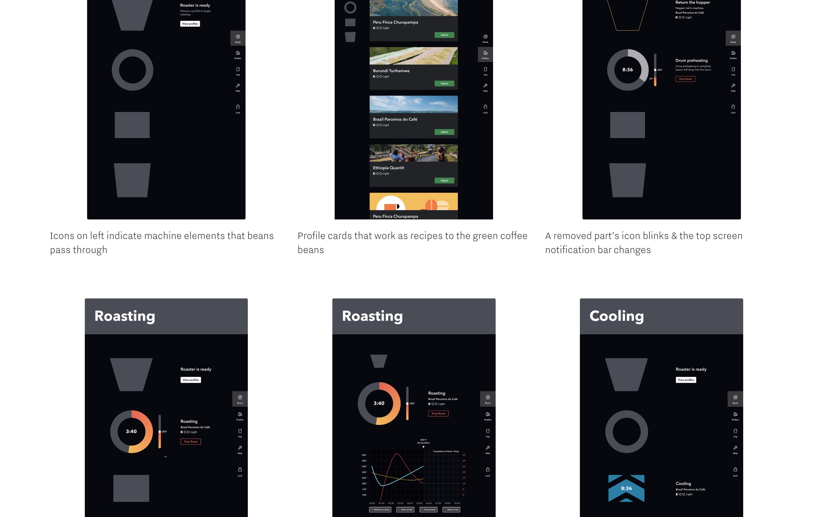
We implemented a system that maps to a touch-point for where beans are in the roaster and what needs to happen next. Rotating through the components of the machine, we created icons for each stage: the hopper at the top, drum below, cycling icon, and finally the bucket. Each screen shows exactly one thing the user needs to do right now.
I worked on creating working prototypes of this new version and getting it in front of a full range of users, from experienced roasters to first-timers, to test our hypothesis.
The Icon System
Hopper
Drum
Roasting
Bucket
Each screen = one step. No hunting through tabs.
2nd Iteration — Screen States
One job per screen.
Deliver
The interface should feel
like the café around it.
After several rounds of testing, the first iteration showed major takeaways: the iconography was immediately clear to users. Following a roast was simplified, and completing one was easy even for roasters who had never roasted coffee before.
I worked on button states, icon states, idle writing, and added motion design to create a unified experience that felt native to the rest of a typical café workflow.
By adding motion to the areas that needed to be noticed in the roaster, and matching the pace of blinking icons to the other blinking indicator lights that typically alert café workers, we created a software interface that matched what a typical user already understood about their environment.
Outcomes & Takeaways
From 47% error rate
to zero.
0%
Error rate after launch, down from 47%
30%
Decrease in task click rate
0
Panel clicks in front of product
1st try
Non-roasters could complete their first roast unassisted
Reflection
What I would do differently: bring the UI more lean, earlier into the conversation. Getting a good routing could have been addressed faster in our timeline. Working in market and agile simultaneously taught me that some collaboration can help software achieve what hardware needs at each stage of development.
The Design